프로젝트: 신사블루스
프로젝트 설계: 폴리머건축사사무소(김호민)
설계담당: 임현주, 이재만
구조설계: 터구조
토목: ㈜정민지오테크
기계설비: ㈜진원엔지니어링
전기통신: ㈜진원엔지니어링
시공: 폴리머건축사사무소
Project: ShinsaBlues
Project Credit: poly.m.ur (Homin Kim)
Design Team: Hyunju Lim, Jaeman Lee
Structural Engineer: theKujo Mechanical
Engineer: Jinwon
Engineering & Consulting Electric Engineer: Jinwon
Engineering & Consulting Contractor: poly.m.ur
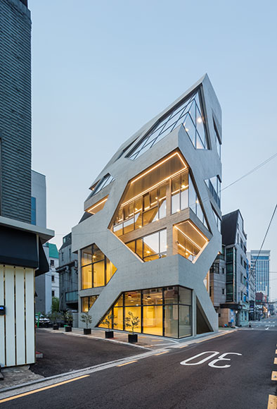
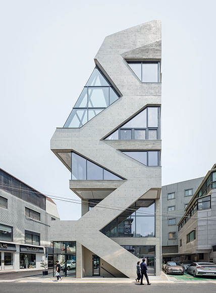
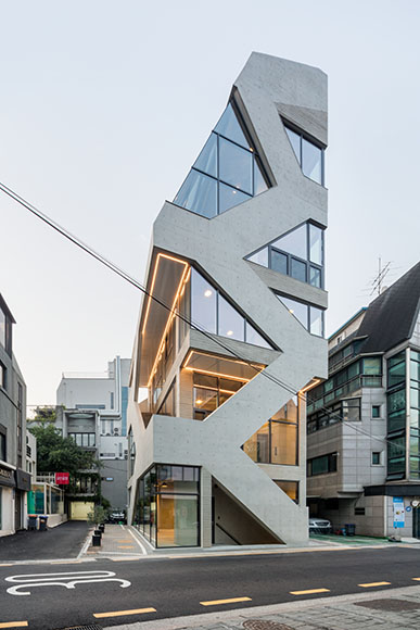
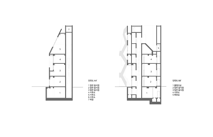
구조적 사선
Structural Diagonals
‘건축은 결국 질서를 구축하는 것이다’ 의 관점에서 신사블루스는 구조와 공간, 기능과 장식, 동선과 표피, 부분과 전체가 통합된 외피의 패턴으로 드러난 프로젝트다. 고딕 성당은 압축력으로 지지하는 석재로 만들어졌기 때문에 구조로부터 장식, 동선, 공간이 한 체계 내에 자연스럽게 일체화될 수 있었다. 한옥도 마찬가지로 목재의 결구 방식만으로 구조와 공간, 장식을 드러냈다. 반면에 근대 건축은 공간과 구조, 동선을 기계의 부속품처럼 분리함으로써 평면과 입면의 자유를 얻었지만 통합된 형태와 질서의 구축이라는 오랜 전통은 간과해버렸다. 여기에 현대 건축은 극도로 분업화되고 산업화된 자본주의 환경에서 에너지와 효율, 경제성, 친환경 등 전보다 훨씬 더 많은 정보들을 소화해야 하는 상황을 맞고 있다. 또한 소통 수단의 발달로 개인의 역할이 강조되면서 개인과 집단의 관계에도 이전에는 경험하지 못했던 변화들을 겪고 있다. 결국 건축은 점점 더 복잡한 정보들을 소화하고 그에 대한 해결책을 내야 하는 어려움에 처해있는 것이다. 그나마 다행스러운 건 설계 과정에 미디어 기술이 정착되면서 패턴이라는 매개체를 통해 많은 정보들을 흡수하고 소화함으로써 통합된 질서와 형태를 구축할 수 있는 여건이 마련되었다는 점이다. 이렇게 변화된 환경에서 건축을 하며 단위와 조직, 부분과 전체, 동선과 공간, 구조와 장식이 하나로 통합된 질서를 찾으려는 노력을 지속해오고 있다.
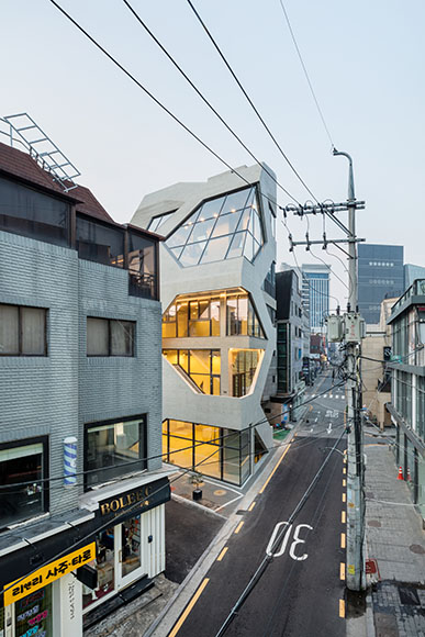
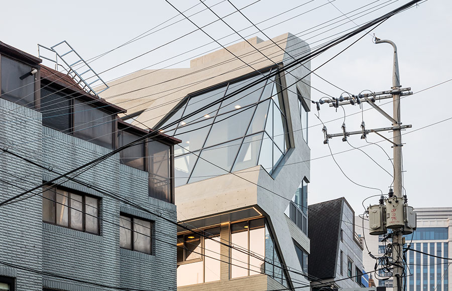
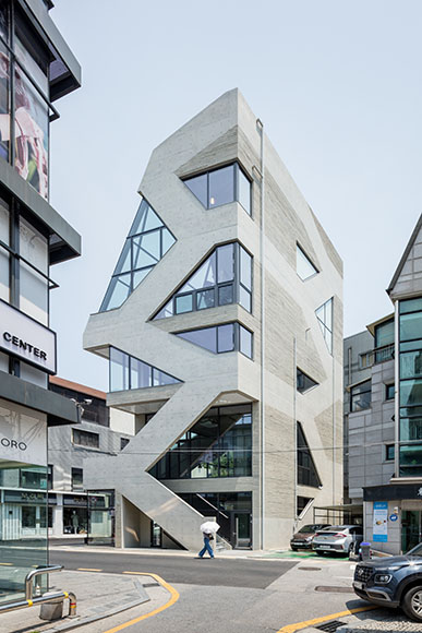
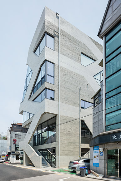
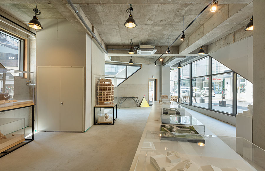
신사블루스는 도산공원 인근 소위 로데오 길에 위치한 소규모 근린생활시설이다. 2000 년대 초까지 사람들로 넘쳐났던 거리는 가로수길이 등장하면서 급격히 활기를 잃었다. 카페와 음식점이 떠나고 옷 가게가 그 자리를 차지하면서 저녁 거리에 불이 꺼지기 시작했다. 번잡함을 즐기려 모였던 사람들은 활기 잃은 길에 발길을 뚝 끊어버린 것이다. 임대료는 그대로인데 수요가 줄고 공실이 늘어나는 악순환이 반복되었다. 1990년대 압구정이라는 새로운 상권의 등장은 무척 신기했지만 그 쇠락은 여태껏 경험해보지 못했던 일이었다. 이 상황에 위기감을 느낀 건물주들이 자체적으로 맛집 유치를 위한 홍보를 제작하고 임대료를 내리는 등 자발적인 노력을 통해 조금씩 거리에 유동인구가 늘어나게 됐다. 결국 사람들은 거리의 밀도를 불편해 하면서도 오히려 그 활기찬 분위기를 즐기고 소비하고 싶어한다는 사실이 흥미로웠다. 이렇게 사람과 차들이 뒤엉켜 지나가기 힘들 정도로 활기차고 역동적인 거리를 내부로 끌어들여 최대한 외부로 열린 상업공간을 만들고자 의도했던 것이 신사블루스다.
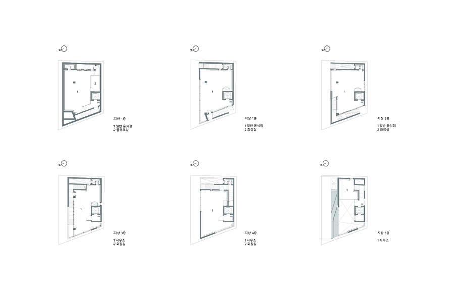
사이트는 1970년대 초 단독주택지로 개발된 60평(184m2)이 채 안 되는 좁은 대지다. 양방향 2차선 도로가 일방통행 길로 바뀌며 갑자기 폭이 좁아지는 병목 지점에 위치해 땅도 좁지만 도로까지 좁아 설계와 시공 과정에서 무척 애를 많이 먹었다. 건물 규모는 계단과 엘리베이터 각각 하나씩 필요한 근린생활시설이다. 1990년대 지어진 주변의 일반 상가들은 대부분 계단과 엘리베이터를 최대한 효율적으로만 계획하여 전면과 1층을 크게 강조한다. 시공 기간을 줄이고 임대를 극대화하는 의도였겠지만 거리에 생동감 있게 대응하는 모습이 아니었다. 더군다나 1층만 거리에 열려 있고 나머지 층은 접근성이 떨어지는 단점도 두드러졌다. 경제적이고 효율적으로 지어진 건물이 상업적으로 경쟁력이 떨어진다는 건 설계에 개선할 기회가 많다는 의미와도 같았다. 무엇보다 일반적인 상업 건물은 건축적으로 아쉬운 점이 많았다. 결국 양과 질, 두 마리 토끼를 동시에 잡을 수 있는 방법을 고민해야 했다. 1층만 외부에 개방되고 2층부터 그 위로는 철저히 내부로 갇히는 전형적인 상업시설은 지양하기로 했는데 이를 위해서는 동선 체계를 개선해야 했다. 달동네의 경사지 건축에서 수직적으로 쌓여 있는 층 사이로 돌아다니는 골목길과 뒤섞인 외부 계단은 언제나 매력적이었다. 주변에서 흔히 보이는 다가구 주택의 외부 계단도 길과 건축, 동네를 연속적으로 만들어준다는 점에서 흥미로웠다. 자생적인 건축이 길과 소통하고 도시로 이어지는 방법은 결국 거리와 연결된 역동적인 길이었다.
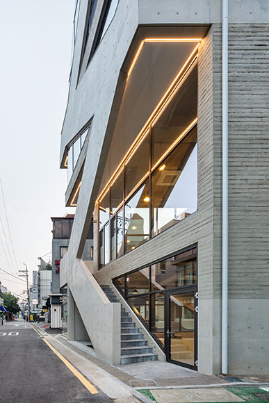
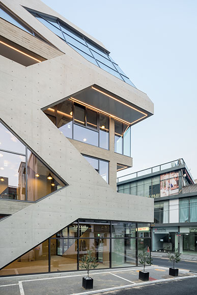
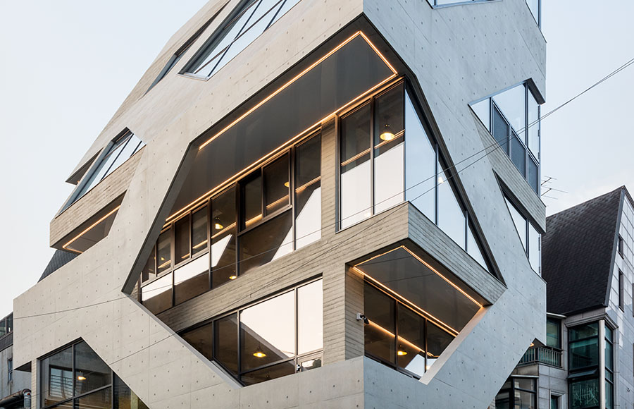
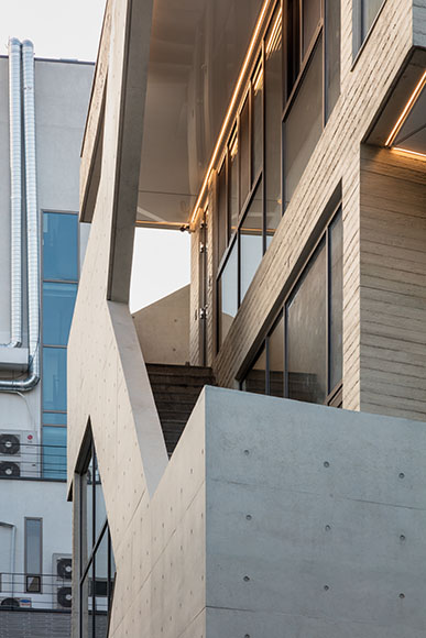
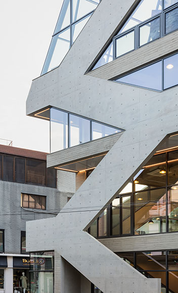
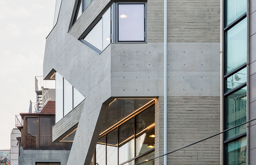
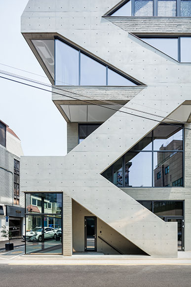
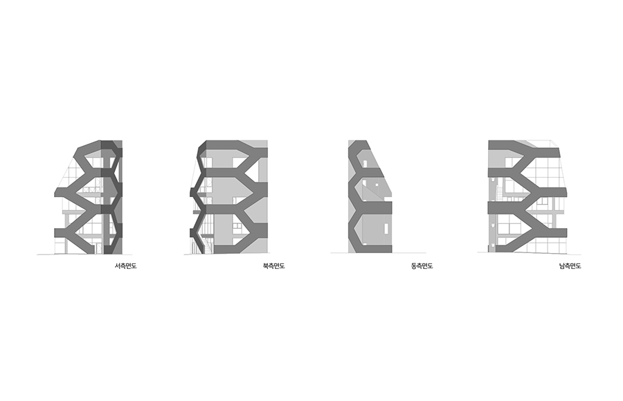
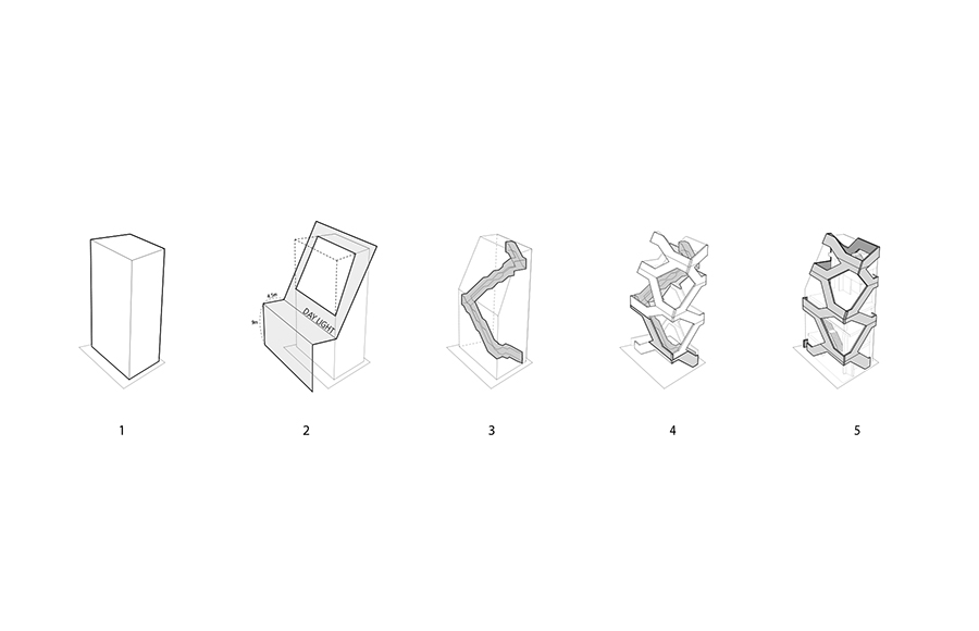
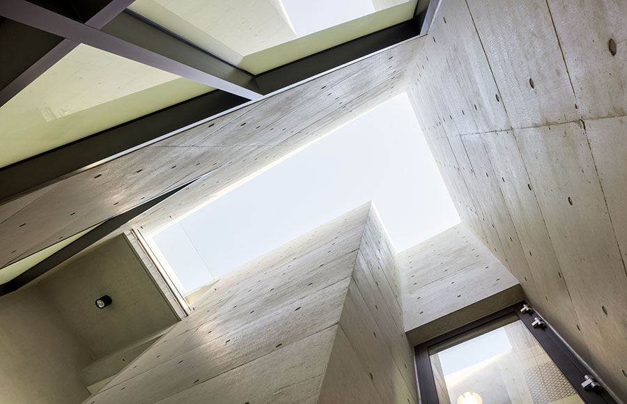
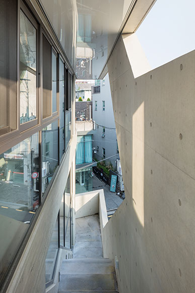
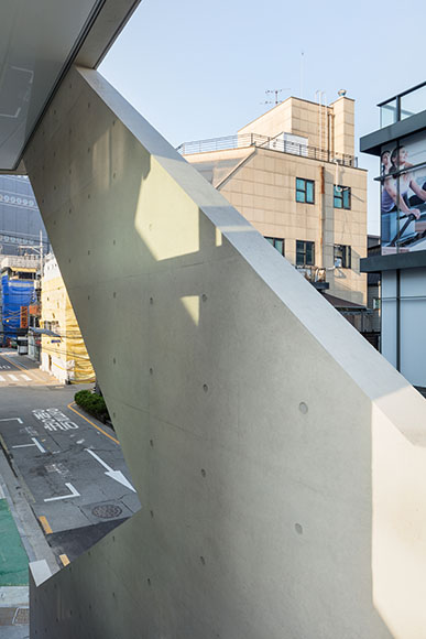
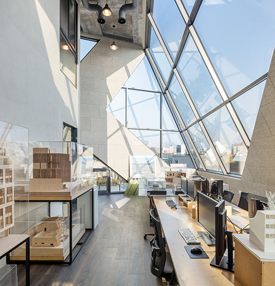
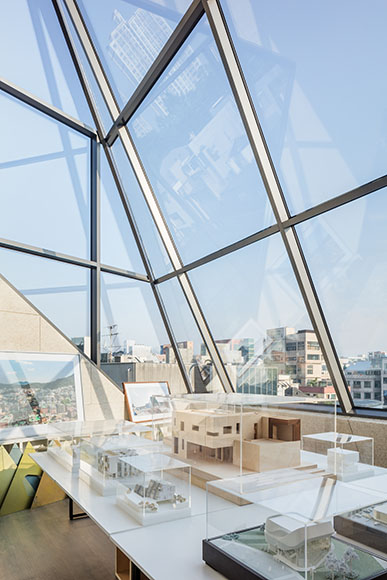
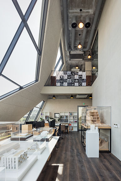
신사블루스의 계단을 외부화함으로써 테라스의 역할을 겸할 수 있고 길을 건물 내부 깊숙이 끌어들이는 효과까지 누릴 수 있었다. 각 층의 접근성을 높이고 상업적 가치를 올릴 수 있는 해결책이 되었다. 궁극적으로는 이렇게 건물을 한 바퀴 도는 외부 계단을 흡수해 통합된 외피의 질서를 어떻게 만드는지가 목표였다. 우선 계단 자체가 오브제로 도드라지지 않기 위해 최소 1.2m 높이의 난간을 외벽의 일부로 흡수하기로 했다. 일정한 높이마다 참이 필요하다는 점을 감안해 사선과 수평선으로 이루어진 난간의 선이 생겼는데 이를 상하좌우로 반복함으로써 육각형들로 이루어진 가상의 패턴을 만들 수 있었다. 이로써 계단은 실제 하나지만 여러 계단들이 있는 것처럼 하여 패턴의 일부로 묻히도록 했다. 입면에서는 에셔의 그림처럼 계단들이 사방으로 흩어지는 것처럼 보이는 부수적인 효과도 있었다. 각 모듈은 가운데 오프닝을 두고 주위를 둘러싼 띠로 구성되는데 그 두께나 크기를 각기 달리함으로써 층이나 향, 공간의 크기에 따라 다를 수밖에 없는 창문 크기나 난간의 높이를 동일한 기하 시스템 내에 흡수할 수 있었다. 사선제한이나 옥상의 외부 난간, 실내 난간들까지 하나의 제스처로 흡수하여 마치 세포들이 모여 생물을 이루는 것처럼 외피 전체가 일관되고 엄격한 기하 체계에서 육각형들로 구성된 하나의 장(Field)이 되었다는 점이 흥미로웠다. 무엇보다 중요한 특징은 이렇게 외부 계단으로부터 도출된 질서가 구조적으로 작동하도록 했다는 점인데 육각형 모듈의 일부가 사선 기둥이 되어 위층을 받치거나 내부의 지붕을 지지하는 역할을 한다. 그런데 건축가로서 가장 즐겼던 건 패턴의 일부가 특별한 역할 없이 순수하게 장식적으로만 쓰였던 지점이었다. 특히 남측 입면은 각 층의 서비스 공간 후면으로 창문이 많이 필요 없었지만 외부 패턴을 그대로 유지하여 노출콘크리트의 질감 차이로만 가상의 선들을 표현했다. 꾸밈(decoration)이 아닌 장식(ornament)은 그 건축이 위치하는 문화와 지역, 시대를 설명하는데 가장 중요한 요소라 생각하기 때문에 필수적이지는 않았지만 필요한 시도였다. 결국 구조와 장식, 기능과 공간, 형태와 분위기가 통합된 하나의 일관된 체계로 설명할 수 있게 되었다.
인류가 처음 지었을 법한 로지에의 원시 오두막은 주변 환경과 완전히 일체화된 모습이었다. 자연의 나무들에 기대 지붕을 세우면 그 자체가 공간이었고 창문이며 동시에 장식이었다. 우리들이 건축가의 개입 없이 지어진 자생적인 건축에 주목하는 것도 더 많은 가능성을 보여주기 때문일 것이다. 달동네처럼 디자인되지 않았기 때문에 오히려 더 풍부한, 건축적 퀄러티 때문일 것이다. 복잡하지만 여유롭고, 조잡하지만 풍부하며, 직설적이지만 명료한 건축을 꿈꿔왔다. 그렇다고 구조와 장식, 동선과 파사드, 기능과 형태의 구분 없는 건축을 꿈꾸는 것이 과거로의 회귀를 의미하지는 않는다. 단지 이것이 나날이 복잡해지는 외부 조건에 건축이 휘둘리는 환경에서 양과 질, 효율과 공간, 기능과 분위기를 동시에 만족시킬 수 있는 하나의 방법론이라 믿기 때문이다.
With the notion that ‘architecture is ultimately about establishing order’ in mind, ShinsaBlues is the kind of project that privileges pattern, in the envelope that integrates structure and space, in function and ornament, in circulation and skin, part and whole. Since the arrival of the Gothic Cathedral, which was made of stone capable of withstanding compressive force, ornamentation, circulation, and spatial configuration could be naturally integrated into one overall structural system. On the other hand, modern architecture achieved greater freedom in plans and elevations that separated space, structure, and circulation like the individual parts of a machine, at the expense of a long tradition of building to an integrated form and order. Contemporary architecture has to deal with more information that ever before, such as energy, efficiency, economy, and eco-friendliness, under an extremely divided and industrialized capitalist environment. In addition, as the scope of individuals expands with the development of communication technologies and networks, the relationship between the individual and group has seen an unprecedented shift. Furthermore, as media technology has gradually been integrated into the design process, the present conditions are ripe for an integrated order and form by absorbing and digesting a lot of information through patterns. ShisaBlues is a small neighborhood living facility located on the so-called ‘Rodeo Road’ near Dosan Park. The street, which was thronged with residents and visitors until the early 2000s, rapidly lost its vitality as Garosu-gil gained popularity. As cafes and restaurants disappeared and clothing stores took their place, the street became darker in the evenings. This vicious cycle of decreasing demand and increasing vacancies while rent remained high was ongoing. The building owners, who were alerted during the decline, made their promotional materials to attract restaurants and voluntarily sacrificed gains (such as lowering the rent) to gradually increase the number of pedestrians on the street. It was interesting to note that people wanted to enjoy and consume a lively atmosphere while also feeling inconvenienced by the high density of the street. ShinsaBlues was designed as a commercial space that would be open to its external environment and location as much as possible by embracing the street that was so lively and dynamic and that it was so difficult for both pedestrians and traffic to move through. The site is a narrow, less than 60-pyeong(184m2), and was home to a detached house in the early 1970s. The two-lane road turns into a one-way road, located at a bottleneck where the road suddenly narrows. The building is a neighborhood living facility that requires one staircase and one elevator. Most of the surrounding general shopping malls built in the 1990s emphasize the front and first floors by planning the stairs and elevators as efficiently as possible. This was also intended to shorten the construction period and to maximize rentals, but there was no lively response to the street. Moreover, only the first floors were not easily accessible. The fact that economically and efficiently built buildings were not commercially competitive also meant that there were many opportunities for design improvements. Above all, general commercial buildings had many architectural flows. The ‘Two-birds-with-one-stone’ approach had to be employed with respects to both the quantity and quality of the structure. A typical commercial facility in which the first floor is open to the outside and completely blocked off inside from the second floor above was to be avoided, so the circulation system had to be improved. In the sloping architecture of the shantytown (daldongne), the alleys and external staircases mingle around the vertically stacked floors, which has also been attractive. The exterior stairs of multi-family houses, commons in the area, were interesting in that they made the road, its architecture, and neighborhood appear continuous. The way autonomous architecture communicates with the road and leads away to the city prompts a certain dynamism. By placing the stairs of ShinsaBlues ouside, the architects created a terrace and the effect of drawing the road deep into the interior of the building. It became a solution that could increase accessibility to each floor and increase commercial value. Ultimately, the goal was how best to create an integrated exterior order by absorbing the external staircase that circles the building. First of all, we decided to absorb the railing at least 1.2m-high as part of the exterior wall so that the staircase itself does not stand out as an object. Because a landing space is required for consistent height, railings made of diagonal and horizontal lines were created. By repeating this up, down, left and right, it created a pattern of hexagons. In this way, the stairs are one structure but they are seen as a component of the pattern as if there were several staircases. This created an illusionary effect as if the stairs were scattering in all directions like those in M.C. Escher’s paintings. Each module is composed of a band surrounding it with a central opening. By varying the thickness or size, the size of the window, or the height of the railing, which inevitably depends on the size of the floor, direction, and space, these elements can be absorbed within the same geometric system. It is interesting to note that the entire outer shell has become a field composed of hexagons in a consistent and strict geometric system as if cells gathering to form a living organism by absorbing the Architecture Slant Line Restriction, the roof’s external railing, and even the indoor railings with a single gesture. The most important feature is that the order derived from the external staircases works structurally; part of the hexagonal module becomes a diagonal column, supporting the upper floor or supporting the roof inside. However, what I enjoyed the most as an architect was the point where part of the pattern was used purely for ornament without any specific role. In particular, the south elevation was at the back of the service space on each floor, so there were not many windows, while the external pattern was maintained and virtual lines were expressed only with a difference in the texture of the exposed concrete. It was not necessarily an essential but a fitting attempt, because it understood that ornament, not decoration, is the most important element in expressing the culture, region, and era in which a work of architecture is located. Eventually, structure and ornament, function and space, and form and atmosphere can all be described as within one coherent system. The Primitive Hut of Laugier, the first of its kind of human dwellings, was completely integrated with its surroundings. Building a roof that would lean on the trees was at once a space, a window, and an ornament. The reason why we pay attention to indigenous architecture built without the intervention of a modern day architect is probably that it reveals greater possibilities. However, dreaming of architecture without the distinction of structure and ornament, circulation and façade, function and form, does not mean a return to the past. It is simply because we believe that this is a methodology that can simultaneously satisfy quantity and quality, efficiency and space, function and atmosphere in a environment where architecture is swayed by increasingly complex external conditions.
신사블루스 프로젝트는 도산공원 인근 소위 로데오 길에 위치한다. 2000 년대 초 사람들이 넘쳐나고 영원히 잘될 것 같던 거리는 가로수길이 등장하면서 급격히 활기를 잃었다. 카페와 레스토랑들이 떠나고 옷 가게들이 그 자리를 차지하자 저녁 거리에 불이 꺼지기 시작했다. 번잡함을 즐기려 모였던 사람들은 활기 없는 길을 보고 발길조차 뚝 끊어버렸다. 90년 대 초 압구정이라는 새로운 상권의 등장도 신기했지만 그 쇠락은 이제까지 경험해보지 못했던 일이기도 했다. 임대료는 그대로인데 수요가 줄고 공실이 늘어나는 악순환이 반복됐다. 흥미로운 건 건물주들이 이 상황을 타계하기 위해 자발적으로 노력했다는 점이다. 2010 년부터 임대료를 낮추고 맛집들을 유치하기 위한 홍보도 자체적으로 제작했다. 그러자 조금씩 거리에 사람들이 늘어나고 다시 카페와 레스토랑들이 들어서는 소위 상업적 재생을 경험하는 중이다.
사이트는 60평이 채 안 되는 좁은 대지다. 도산공원 근처로 양방향 2차선 도로가 일방통행 길로 바뀌며 갑자기 폭이 좁아지는 병목 지점에 위치한다. 땅도 좁지만 도로까지 좁아 설계와 시공에 애를 무척 많이 먹었다. 특히 주변 민원이 만만치 않았다. 규모는 계단 하나, 엘리베이터 하나만 있으면 되는 소규모 근린생활건물이다. 90 년대 지어진 주변의 상가들은 대부분 계단과 엘리베이터를 건물 내부로 감추고 전면으로 1층만 크게 강조했다. 소규모 상가 건물에서 임대료를 극대화하는 방법이었겠지만 거리에 생동감 있게 대응하는 모습은 아니다. 무엇보다 일반적인 상가건물은 건축적으로 아쉽고 상업적으로도 경쟁력이 없었다. 어떻게 하면 양과 질의 두 마리 토끼를 동시에 잡을 수 있을지 고민했다. 1층만 외부에 개방되고 2층부터 위로는 철저히 내부로 갇히는 전형적인 상업시설은 지양하기로 했다. 좁은 길에 사람들과 자동차가 뒤엉키지만 활기 넘치는 거리를 건물 내부로 끌어들일 수 있는 방법은 없을까? 결국 총 연면적이 150 평도 안되는 소규모 상가 건물에서 다르게 해볼 수 있는 건 계단이었다. 소위 집장사들이 지은 다가구 주택에서 외부 계단이 길과 건축을 연속적으로 만들어준다는 점에 착안했다. 자생적인 건축이 길과 소통하고 도시로 이어지는 비법은 결국 도시와 연속적으로 연결된 길과 계단이었다. 또한 계단을 외부화 함으로써 길과 테라스의 역할을 겸할 수 있고 건물 내부까지 깊숙이 끌어들이는 효과가 있다. 결국 각 층의 접근성을 높이고 상업적 가치를 올리면서도 건축적으로도 의미 있는 디자인 해결책이 되었다.
계단은 실제로 하나지만 입면에서의 효과는 에셔의 그림처럼 계단들이 사방으로 흩어지는 것처럼 보인다. 계단이 오브제로 도드라지지 않기 위해 1.2 미터 높이의 난간을 입면 요소로 활용하고 반복하여 확장시켰다. 실제 계단은 하나지만 여러 계단들이 있는 것처럼 하여 패턴의 일부로 묻히도록 한 것이다. 그리고 무엇보다 중요한 특징은 계단이 구조적인 역할을 담당하도록 했다는 점이다. 계단과 난간으로 구성된 외피는 때론 난간으로, 때론 구조체로, 때론 장식으로도 작동할 수 있도록 했다.
Shinsa Blues is located in the area known as the “Rodeo Drive” nearby Dosan Gongwon . It was the hottest place to be and seen in the new Millennium bustling with people, but its reign as the generational ‘it’ place came up un abrupt end replaced by ‘Garosu-gil’. Hip cafes and restaurants were the first to go. Retail businesses, mainly fashion, filled the vacancy, but the vibrancy of the night started to lose its glitz and glamour. When the hustle and bustle that drew the crowd like a magnet fizzled, people simply stopped coming. Rice to the stardom of the newly minted retail zone of Apgujeong area in the early 90s was meteoric, and its fall was equally unprecedented. In the real estate market, rent refused to budget despite plummeting demand. Vacancy increased and fueled further deterioration of the market. One noteworthy fact was that some landlords tried to take some initiatives to deal with the slump. Beginning 2010, some offered lower rents and launch promotion to recruit hip restaurants to the region. The efforts seem to pay off as foot traffic is increasing and trendy cafes and restaurants are leading commercial regeneration of the area.
Shinsa Blues sits on a small, narrow site that is just around 60-pyong near Dosan Gongwon park. It is located at a bottleneck where 2-way street merges abruptly into a narrower one-way street. To be on a small site next to a narrow road meant incredible challenges for design and construction. Complaints from neighbors, especially, proved to be troublesome. Project scope was a small commercial building with one staircase and one elevator in the vicinity of residential zone. Most neighboring commercial buildings built in the ‘90s housed the stairway and elevator internally and highlighted the ground-floor retail space. The elevation could be effective in maximizing rental income for a small commercial building, but it didn’t do much to address the vibrancy of the street. Generic commercial buildings lacked architectural legacy and weren’t really successful in achieving and competitive edge commercially. My design approach started with contemplating ways to achieve both the quality and quantity. I was firm to detach from the typical commercial building design involving only the ground-floor having open accessibility to the exterior and keeping the rest of floors completely wrapped up. The street of Shinsa Blues was narrow, but it was bubbling with energy from passing cars and pedestrians. How can that energy trickle into the building? Wriggle room was so small for a commercial building whose floor area was less than 150-pyong, and I eventually zeroed-in on the use of stair way. The inspiration came from small-scale development vultures whose profit-driven design for multi-family housing projects feature crudely finished external stair way that seem to have a streamline effect connecting the buildings to the street. Secret for self-sustaining architecture to communicate with the street and reach out to the city was using the street and stair way that connects with the city like a grid. External stair way could also function as terrace and extension of the street that could be stretched deep into the building. It was the design solution that eventually ensured accessibility for each floor and higher commercial value as well as architectural character.
It is actually a single stair way, but the elevation makes it look like it splits into different directions like in the works of M.C. Escher. 1.2 meter-tall balustrade is blended into the elevation design by repetition and expansion in order to minimize its presence as architectural objet. There is one stairway, but duplication made it disappear into a pattern. Most importantly, the stairway was also designed to carry structural function. The exterior cladding finished with stairway and balustrade can serve as both structural and design element.
프로젝트 설계: 폴리머건축사사무소(김호민)
설계담당: 임현주, 이재만
구조설계: 터구조
토목: ㈜정민지오테크
기계설비: ㈜진원엔지니어링
전기통신: ㈜진원엔지니어링
시공: 폴리머건축사사무소
Project: ShinsaBlues
Project Credit: poly.m.ur (Homin Kim)
Design Team: Hyunju Lim, Jaeman Lee
Structural Engineer: theKujo Mechanical
Engineer: Jinwon
Engineering & Consulting Electric Engineer: Jinwon
Engineering & Consulting Contractor: poly.m.ur
Description
구조적 사선
Structural Diagonals
‘건축은 결국 질서를 구축하는 것이다’ 의 관점에서 신사블루스는 구조와 공간, 기능과 장식, 동선과 표피, 부분과 전체가 통합된 외피의 패턴으로 드러난 프로젝트다. 고딕 성당은 압축력으로 지지하는 석재로 만들어졌기 때문에 구조로부터 장식, 동선, 공간이 한 체계 내에 자연스럽게 일체화될 수 있었다. 한옥도 마찬가지로 목재의 결구 방식만으로 구조와 공간, 장식을 드러냈다. 반면에 근대 건축은 공간과 구조, 동선을 기계의 부속품처럼 분리함으로써 평면과 입면의 자유를 얻었지만 통합된 형태와 질서의 구축이라는 오랜 전통은 간과해버렸다. 여기에 현대 건축은 극도로 분업화되고 산업화된 자본주의 환경에서 에너지와 효율, 경제성, 친환경 등 전보다 훨씬 더 많은 정보들을 소화해야 하는 상황을 맞고 있다. 또한 소통 수단의 발달로 개인의 역할이 강조되면서 개인과 집단의 관계에도 이전에는 경험하지 못했던 변화들을 겪고 있다. 결국 건축은 점점 더 복잡한 정보들을 소화하고 그에 대한 해결책을 내야 하는 어려움에 처해있는 것이다. 그나마 다행스러운 건 설계 과정에 미디어 기술이 정착되면서 패턴이라는 매개체를 통해 많은 정보들을 흡수하고 소화함으로써 통합된 질서와 형태를 구축할 수 있는 여건이 마련되었다는 점이다. 이렇게 변화된 환경에서 건축을 하며 단위와 조직, 부분과 전체, 동선과 공간, 구조와 장식이 하나로 통합된 질서를 찾으려는 노력을 지속해오고 있다.
신사블루스는 도산공원 인근 소위 로데오 길에 위치한 소규모 근린생활시설이다. 2000 년대 초까지 사람들로 넘쳐났던 거리는 가로수길이 등장하면서 급격히 활기를 잃었다. 카페와 음식점이 떠나고 옷 가게가 그 자리를 차지하면서 저녁 거리에 불이 꺼지기 시작했다. 번잡함을 즐기려 모였던 사람들은 활기 잃은 길에 발길을 뚝 끊어버린 것이다. 임대료는 그대로인데 수요가 줄고 공실이 늘어나는 악순환이 반복되었다. 1990년대 압구정이라는 새로운 상권의 등장은 무척 신기했지만 그 쇠락은 여태껏 경험해보지 못했던 일이었다. 이 상황에 위기감을 느낀 건물주들이 자체적으로 맛집 유치를 위한 홍보를 제작하고 임대료를 내리는 등 자발적인 노력을 통해 조금씩 거리에 유동인구가 늘어나게 됐다. 결국 사람들은 거리의 밀도를 불편해 하면서도 오히려 그 활기찬 분위기를 즐기고 소비하고 싶어한다는 사실이 흥미로웠다. 이렇게 사람과 차들이 뒤엉켜 지나가기 힘들 정도로 활기차고 역동적인 거리를 내부로 끌어들여 최대한 외부로 열린 상업공간을 만들고자 의도했던 것이 신사블루스다.
사이트는 1970년대 초 단독주택지로 개발된 60평(184m2)이 채 안 되는 좁은 대지다. 양방향 2차선 도로가 일방통행 길로 바뀌며 갑자기 폭이 좁아지는 병목 지점에 위치해 땅도 좁지만 도로까지 좁아 설계와 시공 과정에서 무척 애를 많이 먹었다. 건물 규모는 계단과 엘리베이터 각각 하나씩 필요한 근린생활시설이다. 1990년대 지어진 주변의 일반 상가들은 대부분 계단과 엘리베이터를 최대한 효율적으로만 계획하여 전면과 1층을 크게 강조한다. 시공 기간을 줄이고 임대를 극대화하는 의도였겠지만 거리에 생동감 있게 대응하는 모습이 아니었다. 더군다나 1층만 거리에 열려 있고 나머지 층은 접근성이 떨어지는 단점도 두드러졌다. 경제적이고 효율적으로 지어진 건물이 상업적으로 경쟁력이 떨어진다는 건 설계에 개선할 기회가 많다는 의미와도 같았다. 무엇보다 일반적인 상업 건물은 건축적으로 아쉬운 점이 많았다. 결국 양과 질, 두 마리 토끼를 동시에 잡을 수 있는 방법을 고민해야 했다. 1층만 외부에 개방되고 2층부터 그 위로는 철저히 내부로 갇히는 전형적인 상업시설은 지양하기로 했는데 이를 위해서는 동선 체계를 개선해야 했다. 달동네의 경사지 건축에서 수직적으로 쌓여 있는 층 사이로 돌아다니는 골목길과 뒤섞인 외부 계단은 언제나 매력적이었다. 주변에서 흔히 보이는 다가구 주택의 외부 계단도 길과 건축, 동네를 연속적으로 만들어준다는 점에서 흥미로웠다. 자생적인 건축이 길과 소통하고 도시로 이어지는 방법은 결국 거리와 연결된 역동적인 길이었다.
신사블루스의 계단을 외부화함으로써 테라스의 역할을 겸할 수 있고 길을 건물 내부 깊숙이 끌어들이는 효과까지 누릴 수 있었다. 각 층의 접근성을 높이고 상업적 가치를 올릴 수 있는 해결책이 되었다. 궁극적으로는 이렇게 건물을 한 바퀴 도는 외부 계단을 흡수해 통합된 외피의 질서를 어떻게 만드는지가 목표였다. 우선 계단 자체가 오브제로 도드라지지 않기 위해 최소 1.2m 높이의 난간을 외벽의 일부로 흡수하기로 했다. 일정한 높이마다 참이 필요하다는 점을 감안해 사선과 수평선으로 이루어진 난간의 선이 생겼는데 이를 상하좌우로 반복함으로써 육각형들로 이루어진 가상의 패턴을 만들 수 있었다. 이로써 계단은 실제 하나지만 여러 계단들이 있는 것처럼 하여 패턴의 일부로 묻히도록 했다. 입면에서는 에셔의 그림처럼 계단들이 사방으로 흩어지는 것처럼 보이는 부수적인 효과도 있었다. 각 모듈은 가운데 오프닝을 두고 주위를 둘러싼 띠로 구성되는데 그 두께나 크기를 각기 달리함으로써 층이나 향, 공간의 크기에 따라 다를 수밖에 없는 창문 크기나 난간의 높이를 동일한 기하 시스템 내에 흡수할 수 있었다. 사선제한이나 옥상의 외부 난간, 실내 난간들까지 하나의 제스처로 흡수하여 마치 세포들이 모여 생물을 이루는 것처럼 외피 전체가 일관되고 엄격한 기하 체계에서 육각형들로 구성된 하나의 장(Field)이 되었다는 점이 흥미로웠다. 무엇보다 중요한 특징은 이렇게 외부 계단으로부터 도출된 질서가 구조적으로 작동하도록 했다는 점인데 육각형 모듈의 일부가 사선 기둥이 되어 위층을 받치거나 내부의 지붕을 지지하는 역할을 한다. 그런데 건축가로서 가장 즐겼던 건 패턴의 일부가 특별한 역할 없이 순수하게 장식적으로만 쓰였던 지점이었다. 특히 남측 입면은 각 층의 서비스 공간 후면으로 창문이 많이 필요 없었지만 외부 패턴을 그대로 유지하여 노출콘크리트의 질감 차이로만 가상의 선들을 표현했다. 꾸밈(decoration)이 아닌 장식(ornament)은 그 건축이 위치하는 문화와 지역, 시대를 설명하는데 가장 중요한 요소라 생각하기 때문에 필수적이지는 않았지만 필요한 시도였다. 결국 구조와 장식, 기능과 공간, 형태와 분위기가 통합된 하나의 일관된 체계로 설명할 수 있게 되었다.
인류가 처음 지었을 법한 로지에의 원시 오두막은 주변 환경과 완전히 일체화된 모습이었다. 자연의 나무들에 기대 지붕을 세우면 그 자체가 공간이었고 창문이며 동시에 장식이었다. 우리들이 건축가의 개입 없이 지어진 자생적인 건축에 주목하는 것도 더 많은 가능성을 보여주기 때문일 것이다. 달동네처럼 디자인되지 않았기 때문에 오히려 더 풍부한, 건축적 퀄러티 때문일 것이다. 복잡하지만 여유롭고, 조잡하지만 풍부하며, 직설적이지만 명료한 건축을 꿈꿔왔다. 그렇다고 구조와 장식, 동선과 파사드, 기능과 형태의 구분 없는 건축을 꿈꾸는 것이 과거로의 회귀를 의미하지는 않는다. 단지 이것이 나날이 복잡해지는 외부 조건에 건축이 휘둘리는 환경에서 양과 질, 효율과 공간, 기능과 분위기를 동시에 만족시킬 수 있는 하나의 방법론이라 믿기 때문이다.
With the notion that ‘architecture is ultimately about establishing order’ in mind, ShinsaBlues is the kind of project that privileges pattern, in the envelope that integrates structure and space, in function and ornament, in circulation and skin, part and whole. Since the arrival of the Gothic Cathedral, which was made of stone capable of withstanding compressive force, ornamentation, circulation, and spatial configuration could be naturally integrated into one overall structural system. On the other hand, modern architecture achieved greater freedom in plans and elevations that separated space, structure, and circulation like the individual parts of a machine, at the expense of a long tradition of building to an integrated form and order. Contemporary architecture has to deal with more information that ever before, such as energy, efficiency, economy, and eco-friendliness, under an extremely divided and industrialized capitalist environment. In addition, as the scope of individuals expands with the development of communication technologies and networks, the relationship between the individual and group has seen an unprecedented shift. Furthermore, as media technology has gradually been integrated into the design process, the present conditions are ripe for an integrated order and form by absorbing and digesting a lot of information through patterns. ShisaBlues is a small neighborhood living facility located on the so-called ‘Rodeo Road’ near Dosan Park. The street, which was thronged with residents and visitors until the early 2000s, rapidly lost its vitality as Garosu-gil gained popularity. As cafes and restaurants disappeared and clothing stores took their place, the street became darker in the evenings. This vicious cycle of decreasing demand and increasing vacancies while rent remained high was ongoing. The building owners, who were alerted during the decline, made their promotional materials to attract restaurants and voluntarily sacrificed gains (such as lowering the rent) to gradually increase the number of pedestrians on the street. It was interesting to note that people wanted to enjoy and consume a lively atmosphere while also feeling inconvenienced by the high density of the street. ShinsaBlues was designed as a commercial space that would be open to its external environment and location as much as possible by embracing the street that was so lively and dynamic and that it was so difficult for both pedestrians and traffic to move through. The site is a narrow, less than 60-pyeong(184m2), and was home to a detached house in the early 1970s. The two-lane road turns into a one-way road, located at a bottleneck where the road suddenly narrows. The building is a neighborhood living facility that requires one staircase and one elevator. Most of the surrounding general shopping malls built in the 1990s emphasize the front and first floors by planning the stairs and elevators as efficiently as possible. This was also intended to shorten the construction period and to maximize rentals, but there was no lively response to the street. Moreover, only the first floors were not easily accessible. The fact that economically and efficiently built buildings were not commercially competitive also meant that there were many opportunities for design improvements. Above all, general commercial buildings had many architectural flows. The ‘Two-birds-with-one-stone’ approach had to be employed with respects to both the quantity and quality of the structure. A typical commercial facility in which the first floor is open to the outside and completely blocked off inside from the second floor above was to be avoided, so the circulation system had to be improved. In the sloping architecture of the shantytown (daldongne), the alleys and external staircases mingle around the vertically stacked floors, which has also been attractive. The exterior stairs of multi-family houses, commons in the area, were interesting in that they made the road, its architecture, and neighborhood appear continuous. The way autonomous architecture communicates with the road and leads away to the city prompts a certain dynamism. By placing the stairs of ShinsaBlues ouside, the architects created a terrace and the effect of drawing the road deep into the interior of the building. It became a solution that could increase accessibility to each floor and increase commercial value. Ultimately, the goal was how best to create an integrated exterior order by absorbing the external staircase that circles the building. First of all, we decided to absorb the railing at least 1.2m-high as part of the exterior wall so that the staircase itself does not stand out as an object. Because a landing space is required for consistent height, railings made of diagonal and horizontal lines were created. By repeating this up, down, left and right, it created a pattern of hexagons. In this way, the stairs are one structure but they are seen as a component of the pattern as if there were several staircases. This created an illusionary effect as if the stairs were scattering in all directions like those in M.C. Escher’s paintings. Each module is composed of a band surrounding it with a central opening. By varying the thickness or size, the size of the window, or the height of the railing, which inevitably depends on the size of the floor, direction, and space, these elements can be absorbed within the same geometric system. It is interesting to note that the entire outer shell has become a field composed of hexagons in a consistent and strict geometric system as if cells gathering to form a living organism by absorbing the Architecture Slant Line Restriction, the roof’s external railing, and even the indoor railings with a single gesture. The most important feature is that the order derived from the external staircases works structurally; part of the hexagonal module becomes a diagonal column, supporting the upper floor or supporting the roof inside. However, what I enjoyed the most as an architect was the point where part of the pattern was used purely for ornament without any specific role. In particular, the south elevation was at the back of the service space on each floor, so there were not many windows, while the external pattern was maintained and virtual lines were expressed only with a difference in the texture of the exposed concrete. It was not necessarily an essential but a fitting attempt, because it understood that ornament, not decoration, is the most important element in expressing the culture, region, and era in which a work of architecture is located. Eventually, structure and ornament, function and space, and form and atmosphere can all be described as within one coherent system. The Primitive Hut of Laugier, the first of its kind of human dwellings, was completely integrated with its surroundings. Building a roof that would lean on the trees was at once a space, a window, and an ornament. The reason why we pay attention to indigenous architecture built without the intervention of a modern day architect is probably that it reveals greater possibilities. However, dreaming of architecture without the distinction of structure and ornament, circulation and façade, function and form, does not mean a return to the past. It is simply because we believe that this is a methodology that can simultaneously satisfy quantity and quality, efficiency and space, function and atmosphere in a environment where architecture is swayed by increasingly complex external conditions.
신사블루스 프로젝트는 도산공원 인근 소위 로데오 길에 위치한다. 2000 년대 초 사람들이 넘쳐나고 영원히 잘될 것 같던 거리는 가로수길이 등장하면서 급격히 활기를 잃었다. 카페와 레스토랑들이 떠나고 옷 가게들이 그 자리를 차지하자 저녁 거리에 불이 꺼지기 시작했다. 번잡함을 즐기려 모였던 사람들은 활기 없는 길을 보고 발길조차 뚝 끊어버렸다. 90년 대 초 압구정이라는 새로운 상권의 등장도 신기했지만 그 쇠락은 이제까지 경험해보지 못했던 일이기도 했다. 임대료는 그대로인데 수요가 줄고 공실이 늘어나는 악순환이 반복됐다. 흥미로운 건 건물주들이 이 상황을 타계하기 위해 자발적으로 노력했다는 점이다. 2010 년부터 임대료를 낮추고 맛집들을 유치하기 위한 홍보도 자체적으로 제작했다. 그러자 조금씩 거리에 사람들이 늘어나고 다시 카페와 레스토랑들이 들어서는 소위 상업적 재생을 경험하는 중이다.
사이트는 60평이 채 안 되는 좁은 대지다. 도산공원 근처로 양방향 2차선 도로가 일방통행 길로 바뀌며 갑자기 폭이 좁아지는 병목 지점에 위치한다. 땅도 좁지만 도로까지 좁아 설계와 시공에 애를 무척 많이 먹었다. 특히 주변 민원이 만만치 않았다. 규모는 계단 하나, 엘리베이터 하나만 있으면 되는 소규모 근린생활건물이다. 90 년대 지어진 주변의 상가들은 대부분 계단과 엘리베이터를 건물 내부로 감추고 전면으로 1층만 크게 강조했다. 소규모 상가 건물에서 임대료를 극대화하는 방법이었겠지만 거리에 생동감 있게 대응하는 모습은 아니다. 무엇보다 일반적인 상가건물은 건축적으로 아쉽고 상업적으로도 경쟁력이 없었다. 어떻게 하면 양과 질의 두 마리 토끼를 동시에 잡을 수 있을지 고민했다. 1층만 외부에 개방되고 2층부터 위로는 철저히 내부로 갇히는 전형적인 상업시설은 지양하기로 했다. 좁은 길에 사람들과 자동차가 뒤엉키지만 활기 넘치는 거리를 건물 내부로 끌어들일 수 있는 방법은 없을까? 결국 총 연면적이 150 평도 안되는 소규모 상가 건물에서 다르게 해볼 수 있는 건 계단이었다. 소위 집장사들이 지은 다가구 주택에서 외부 계단이 길과 건축을 연속적으로 만들어준다는 점에 착안했다. 자생적인 건축이 길과 소통하고 도시로 이어지는 비법은 결국 도시와 연속적으로 연결된 길과 계단이었다. 또한 계단을 외부화 함으로써 길과 테라스의 역할을 겸할 수 있고 건물 내부까지 깊숙이 끌어들이는 효과가 있다. 결국 각 층의 접근성을 높이고 상업적 가치를 올리면서도 건축적으로도 의미 있는 디자인 해결책이 되었다.
계단은 실제로 하나지만 입면에서의 효과는 에셔의 그림처럼 계단들이 사방으로 흩어지는 것처럼 보인다. 계단이 오브제로 도드라지지 않기 위해 1.2 미터 높이의 난간을 입면 요소로 활용하고 반복하여 확장시켰다. 실제 계단은 하나지만 여러 계단들이 있는 것처럼 하여 패턴의 일부로 묻히도록 한 것이다. 그리고 무엇보다 중요한 특징은 계단이 구조적인 역할을 담당하도록 했다는 점이다. 계단과 난간으로 구성된 외피는 때론 난간으로, 때론 구조체로, 때론 장식으로도 작동할 수 있도록 했다.
Shinsa Blues is located in the area known as the “Rodeo Drive” nearby Dosan Gongwon . It was the hottest place to be and seen in the new Millennium bustling with people, but its reign as the generational ‘it’ place came up un abrupt end replaced by ‘Garosu-gil’. Hip cafes and restaurants were the first to go. Retail businesses, mainly fashion, filled the vacancy, but the vibrancy of the night started to lose its glitz and glamour. When the hustle and bustle that drew the crowd like a magnet fizzled, people simply stopped coming. Rice to the stardom of the newly minted retail zone of Apgujeong area in the early 90s was meteoric, and its fall was equally unprecedented. In the real estate market, rent refused to budget despite plummeting demand. Vacancy increased and fueled further deterioration of the market. One noteworthy fact was that some landlords tried to take some initiatives to deal with the slump. Beginning 2010, some offered lower rents and launch promotion to recruit hip restaurants to the region. The efforts seem to pay off as foot traffic is increasing and trendy cafes and restaurants are leading commercial regeneration of the area.
Shinsa Blues sits on a small, narrow site that is just around 60-pyong near Dosan Gongwon park. It is located at a bottleneck where 2-way street merges abruptly into a narrower one-way street. To be on a small site next to a narrow road meant incredible challenges for design and construction. Complaints from neighbors, especially, proved to be troublesome. Project scope was a small commercial building with one staircase and one elevator in the vicinity of residential zone. Most neighboring commercial buildings built in the ‘90s housed the stairway and elevator internally and highlighted the ground-floor retail space. The elevation could be effective in maximizing rental income for a small commercial building, but it didn’t do much to address the vibrancy of the street. Generic commercial buildings lacked architectural legacy and weren’t really successful in achieving and competitive edge commercially. My design approach started with contemplating ways to achieve both the quality and quantity. I was firm to detach from the typical commercial building design involving only the ground-floor having open accessibility to the exterior and keeping the rest of floors completely wrapped up. The street of Shinsa Blues was narrow, but it was bubbling with energy from passing cars and pedestrians. How can that energy trickle into the building? Wriggle room was so small for a commercial building whose floor area was less than 150-pyong, and I eventually zeroed-in on the use of stair way. The inspiration came from small-scale development vultures whose profit-driven design for multi-family housing projects feature crudely finished external stair way that seem to have a streamline effect connecting the buildings to the street. Secret for self-sustaining architecture to communicate with the street and reach out to the city was using the street and stair way that connects with the city like a grid. External stair way could also function as terrace and extension of the street that could be stretched deep into the building. It was the design solution that eventually ensured accessibility for each floor and higher commercial value as well as architectural character.
It is actually a single stair way, but the elevation makes it look like it splits into different directions like in the works of M.C. Escher. 1.2 meter-tall balustrade is blended into the elevation design by repetition and expansion in order to minimize its presence as architectural objet. There is one stairway, but duplication made it disappear into a pattern. Most importantly, the stairway was also designed to carry structural function. The exterior cladding finished with stairway and balustrade can serve as both structural and design element.